Creative Director + Designer
Digital + Traditional
Creative Director + Designer
Creative Director + Designer
Bausch +Lomb, Inc.
Bausch + Lomb
2014
2014
Insight
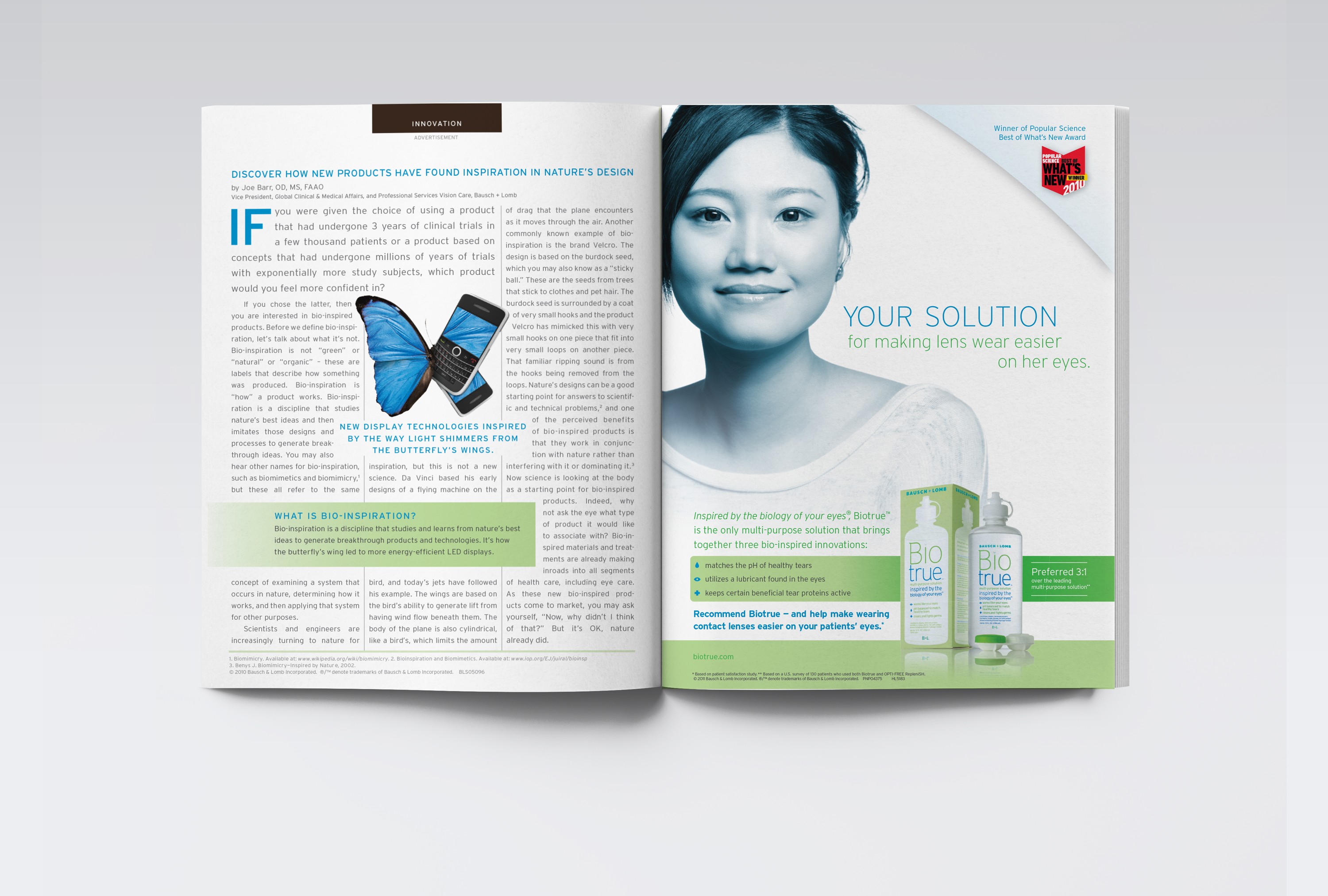
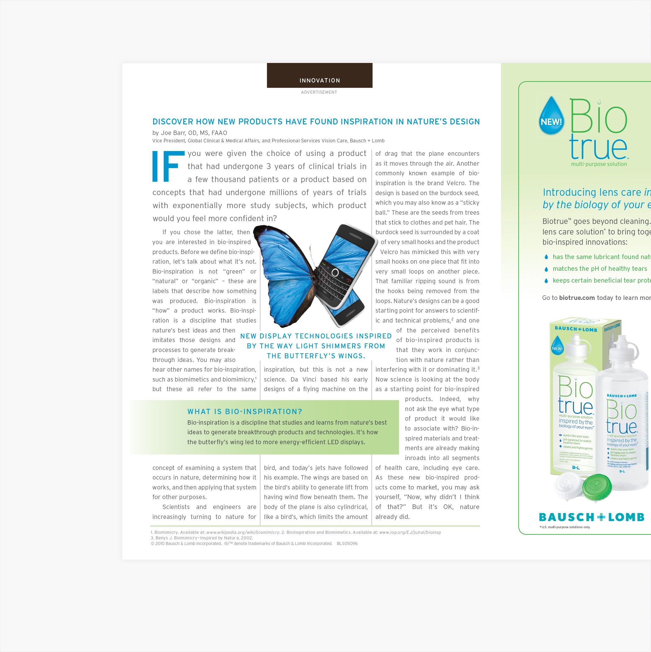
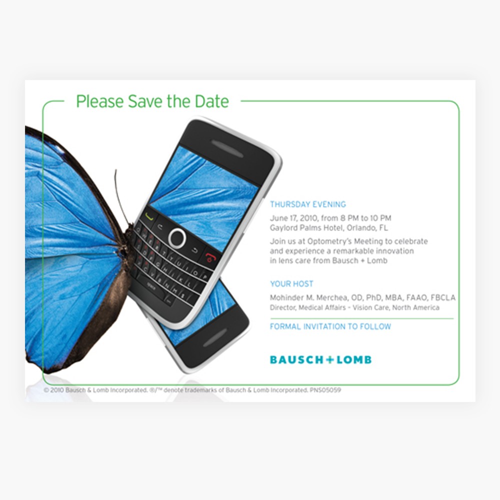
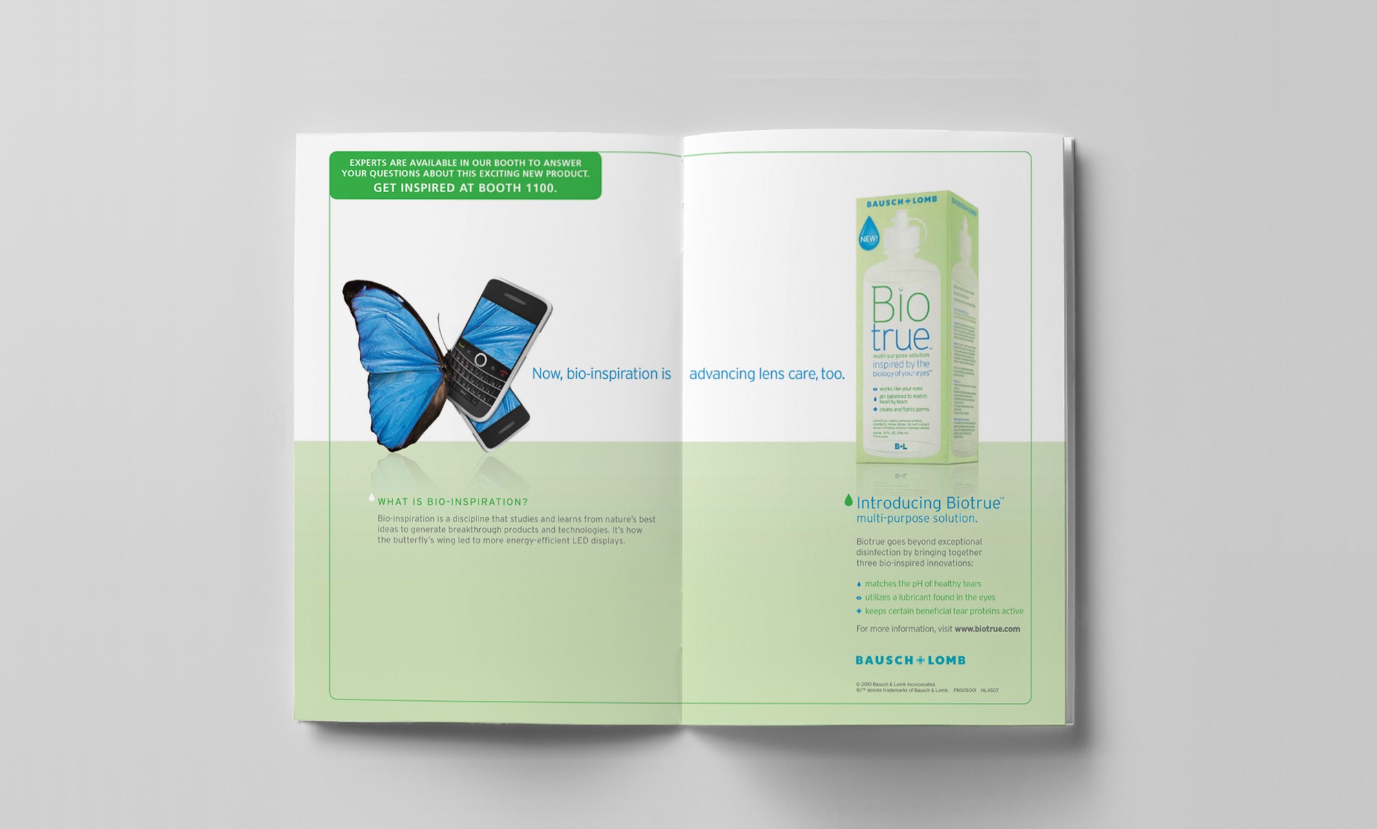
Helping people live better through bio-inspiration. While the wings of a butterfly have inspired solar cells and digital screen design, Biotrue™ is an innovative contact lens solution that is based on the biology of the eye.
A breakthrough in its category, Biotrue™ employs principles of biomimetics—a field of science that mimics nature to create optimal products. The multi-purpose solution works like the eye to help lenses stay ph accurate, clean and moist throughout the day.
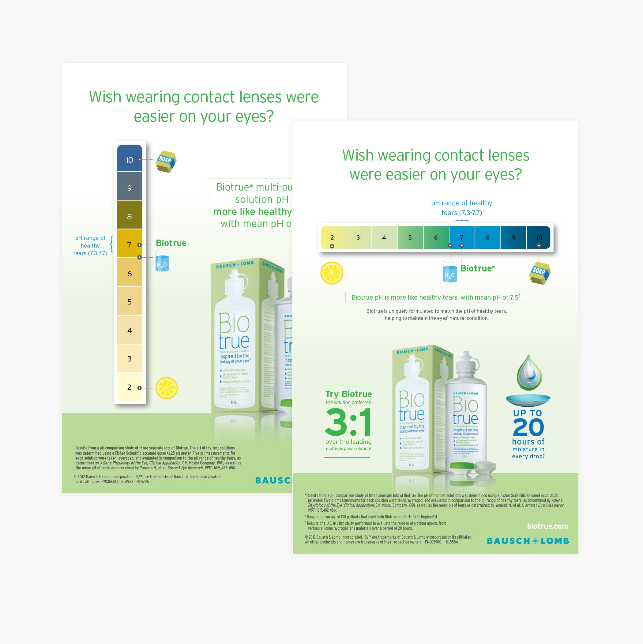
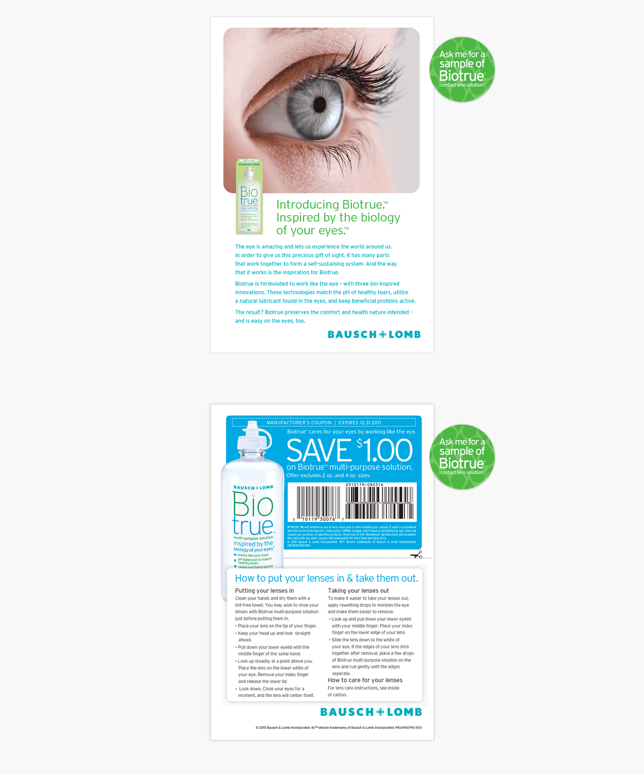
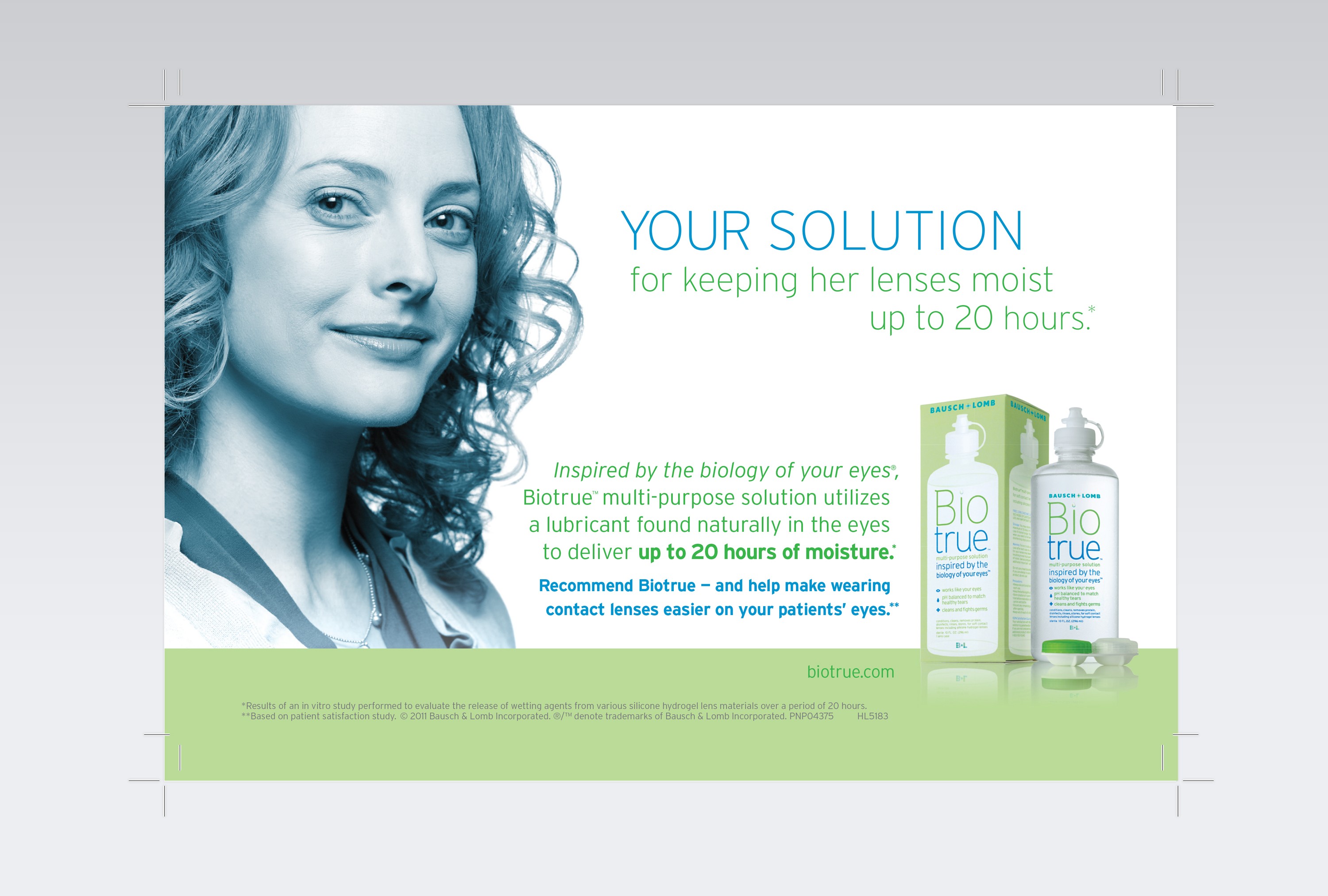
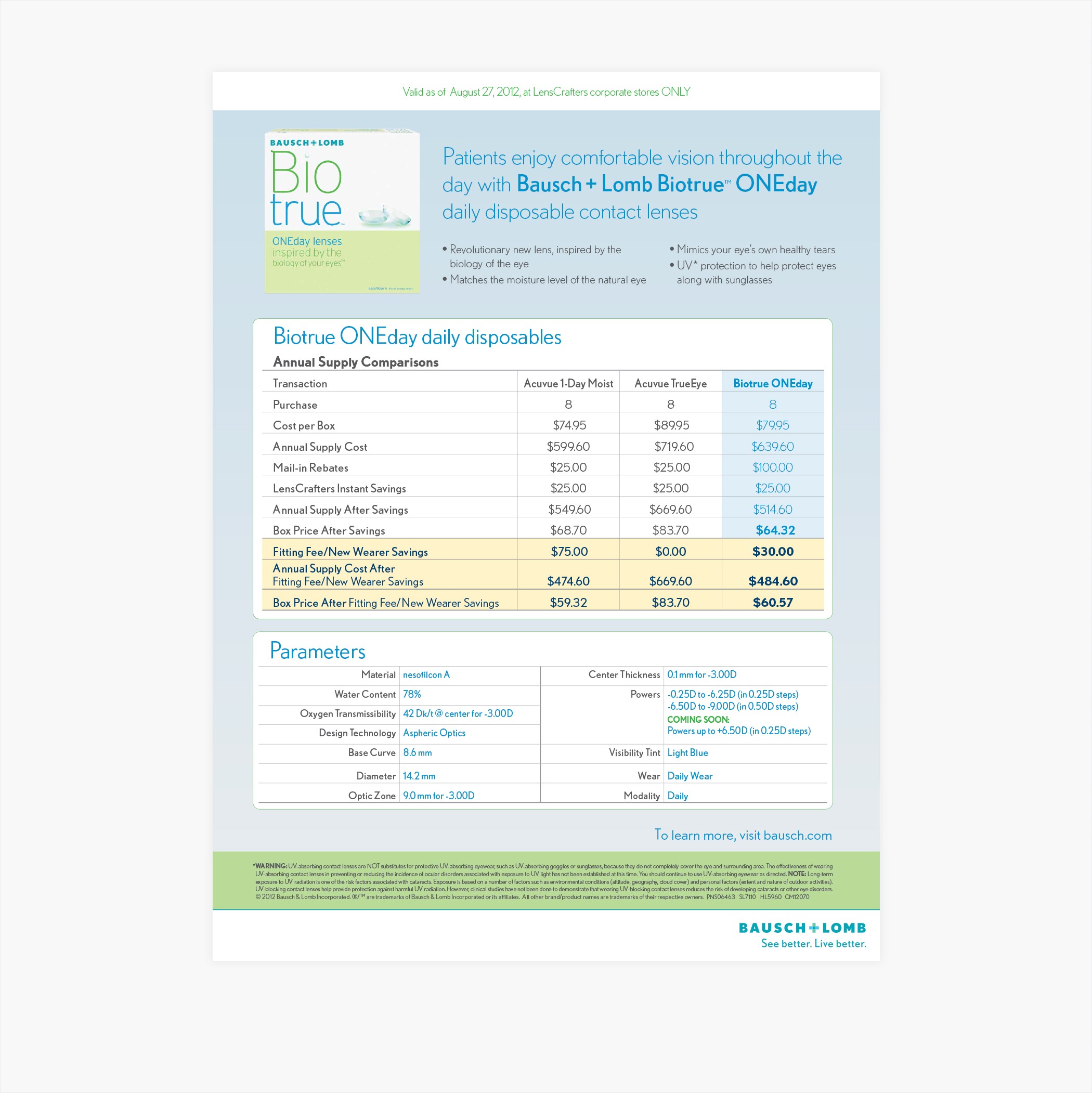
Art direction and design was informed by Bausch’s extensive research, and utilized the Biotrue™ logo and bottle packaging developed by the very talented Paula Scher of Pentagram. Intentionally weaving together themes of water, nature, simplicity, and freshness was successful through the use of gentle gradients, subtle reflection, color, and ample negative space. Keeping the art direction simple and modern reflected the product’s scientifically advanced position in its category. As brand steward, applying this method consistently to pieces for varied audiences was top of mind. Wether targeting eye-care professionals, consumers, or pharmacies, the message and brand stood out amongst its competitors splendidly.
Deliverables
For Bausch + Lomb, Vision Care Division:
Art Direction
Point-of-Sale Displays
Free-Standing Inserts
Rebates
Advertising Editorial
Digital Sellsheets
and more
Industry
Healthcare / Pharma
Year
2022
Client
My Role
As brand steward over three years, I designed more than 400 bio-inspired brand pieces for the Biotrue™ brand in an ongoing, close collaboration with the Bausch + Lomb salesforce and legal teams.
Team
Associate Art Director: Tanya Jessica (via Partners + Napier, agency) Logo + Packaging: Paula Scher, Pentagram Agency Greenwich Marketing Group developed the brand name Biotrue™ and the core positioning premise––“inspired by the biology of your eyes™”
Insight
Helping people live better through bio-inspiration. While the wings of a butterfly have inspired solar cells and digital screen design, Biotrue™ is an innovative contact lens solution that is based on the biology of the eye.
A breakthrough in its category, Biotrue™ employs principles of biomimetics—a field of science that mimics nature to create optimal products. The multi-purpose solution works like the eye to help lenses stay ph accurate, clean and moist throughout the day.
Art direction and design was informed by Bausch’s extensive research, and utilized the Biotrue™ logo and bottle packaging developed by the very talented Paula Scher of Pentagram. Intentionally weaving together themes of water, nature, simplicity, and freshness was successful through the use of gentle gradients, subtle reflection, color, and ample negative space. Keeping the art direction simple and modern reflected the product’s scientifically advanced position in its category. As brand steward, applying this method consistently to pieces for varied audiences was top of mind. Wether targeting eye-care professionals, consumers, or pharmacies, the message and brand stood out amongst its competitors splendidly.
My Role
As brand steward over three years, I designed more than 400 bio-inspired brand pieces for the Biotrue™ brand in an ongoing, close collaboration with the Bausch + Lomb salesforce and legal teams.
Deliverables
For Bausch + Lomb, Vision Care Division:
Art Direction
Point-of-Sale Displays
Free-Standing Inserts
Rebates
Advertising Editorial
Digital Sellsheets
and more
Industry
Healthcare / Pharma
Bausch +Lomb, Inc.
Bausch + Lomb
2014

Insight
Helping people live better through bio-inspiration. While the wings of a butterfly have inspired solar cells and digital screen design, Biotrue™ is an innovative contact lens solution that is based on the biology of the eye.
A breakthrough in its category, Biotrue™ employs principles of biomimetics—a field of science that mimics nature to create optimal products. The multi-purpose solution works like the eye to help lenses stay ph accurate, clean and moist throughout the day.
Art direction and design was informed by Bausch’s extensive research, and utilized the Biotrue™ logo and bottle packaging developed by the very talented Paula Scher of Pentagram. Intentionally weaving together themes of water, nature, simplicity, and freshness was successful through the use of gentle gradients, subtle reflection, color, and ample negative space. Keeping the art direction simple and modern reflected the product’s scientifically advanced position in its category. As brand steward, applying this method consistently to pieces for varied audiences was top of mind. Wether targeting eye-care professionals, consumers, or pharmacies, the message and brand stood out amongst its competitors splendidly.
Deliverables
For Bausch + Lomb, Vision Care Division:
Art Direction
Point-of-Sale Displays
Free-Standing Inserts
Rebates
Advertising Editorial
Digital Sellsheets
and more
Industry
Healthcare / Pharma
Year
2022
Client
My Role
As brand steward over three years, I designed more than 400 bio-inspired brand pieces for the Biotrue™ brand in an ongoing, close collaboration with the Bausch + Lomb salesforce and legal teams.
Team
Associate Art Director: Tanya Jessica (via Partners + Napier, agency) Logo + Packaging: Paula Scher, Pentagram Agency Greenwich Marketing Group developed the brand name Biotrue™ and the core positioning premise––“inspired by the biology of your eyes™”
Insight
Helping people live better through bio-inspiration. While the wings of a butterfly have inspired solar cells and digital screen design, Biotrue™ is an innovative contact lens solution that is based on the biology of the eye.
A breakthrough in its category, Biotrue™ employs principles of biomimetics—a field of science that mimics nature to create optimal products. The multi-purpose solution works like the eye to help lenses stay ph accurate, clean and moist throughout the day.
Art direction and design was informed by Bausch’s extensive research, and utilized the Biotrue™ logo and bottle packaging developed by the very talented Paula Scher of Pentagram. Intentionally weaving together themes of water, nature, simplicity, and freshness was successful through the use of gentle gradients, subtle reflection, color, and ample negative space. Keeping the art direction simple and modern reflected the product’s scientifically advanced position in its category. As brand steward, applying this method consistently to pieces for varied audiences was top of mind. Wether targeting eye-care professionals, consumers, or pharmacies, the message and brand stood out amongst its competitors splendidly.
My Role
As brand steward over three years, I designed more than 400 bio-inspired brand pieces for the Biotrue™ brand in an ongoing, close collaboration with the Bausch + Lomb salesforce and legal teams.
Deliverables
For Bausch + Lomb, Vision Care Division:
Art Direction
Point-of-Sale Displays
Free-Standing Inserts
Rebates
Advertising Editorial
Digital Sellsheets
and more
Industry
Healthcare / Pharma
